Maybe you know your website is outdated, but you don’t know what would make it look current. Here are some observations and opinions about web design in 2017 and how to look current.
And yes, looking outdated can be a problem, because websites are for newcomers. When a seeker finds a website that looks like it hasn’t been updated in five years, they wonder “is this group still around?” In fact, a pair of first time guests at my meeting a few weeks ago explicitly told me they’d ruled out the first meeting in their Google results because the website looked so outdated. They didn’t know whether they could trust the information.
The data showed that the average consumer paid far more attention to the superficial aspects of a site, such as visual cues, than to its content. For example, nearly half of all consumers (or 46.1%) in the study assessed the credibility of sites based in part on the appeal of the overall visual design of a site, including layout, typography, font size and color schemes.
—Fogg, BJ, PhD. “How Do People Evaluate a Web Site’s Credibility?” Stanford University’s Persuasive Technology Lab
Yes, this stuff matters. I know you want to think “function is more important than form!” If people never get to your content because the form has scared them off, then you have failed at function.
Throughout this, when I say “we,” I probably mean web developers. I’ve been building websites for 20 years.
Things to avoid
- Boxed layouts
- Gradients
- Sliders
Boxed layouts
Let’s do a comparison. Look at these two screenshots.
This was Hasbro’s website in 2010, though the copyright notice tells us it was actually built in 2008.

Hasbro’s website in 2010 shows that boxed layouts were the norm at that time (site designed in 2008)
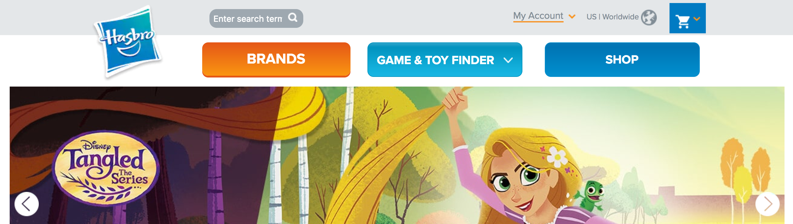
Hasbro’s 2017 website, taking the full width of the screen
Boxed layouts were a way developers hacked around the way screen sizes were changing in the late naughts. Suddenly we went from screen resolutions of 800×600 to 1920×1080. Suddenly the iPhone was invented, and its screen was completely different from a desktop.
Making a website fit nicely on all those sizes used to be hard. There were growing pains. Web technology needed to catch up. The trick we used was to decide on a fixed width (which would just not support screens smaller than it), and then put a bunch of blank space on the left and right. What can I say? It looked better than having a fixed width where everything was shoved to the left if your screen was big. We worked with what we had.
Thankfully, web technology advanced. We can make websites that are responsive (they scale nicely) instead of fixed-width and are full screen instead of boxed. The boxed layout trend lasted from about 2007 to 2015, but it’s now looking pretty dated.
Blogs are the place you still tend to find them, but having your meeting website look like a blog automatically makes it look more amateur.
Bold gradients & glassy effects
Gradients and glassy effects were a real flash-in-the-pan trend, part of “Web 2.0.” Back around 2007, web designers were using image tricks to shoehorn gradients onto the web. Around 2010–2011, gradients became easy to code, after they’d already become ubiquitous. Everyone used them. Everyone. And then by 2014, they were like powder blue bell-bottomed suits with huge lapels.
Web 2.0 styling was already being declared stale in 2008 and just plain bad for business by 2012. While we’re at it, familiarize yourself with what was on trend 5 years ago in 2012, so you can be sure not to pile too many of these together.
If you’re using gradients to add some very subtle 3-D effects, that’s fine. Add a little drop shadow while you’re at it. Especially keep buttons and navigation bars free of glassy effects and bold gradients. Solid colors are just fine. Simple. Plain, even.
Now, this isn’t a complete ban. We’ll touch on a modern use of bold gradients down in the hero images section.
Sliders
These are also called carousels. You know those big images with arrows either side, and they change picture every 3 seconds, and each picture links to a different page?
Ok, maybe you didn’t notice that they change every 3 seconds, because you didn’t sit there, staring and waiting for it to change.
Neither will the people who visit your meeting website.
I know why you do this. Three different committees are insisting that they get front page space too. You can’t say that one thing is more important that the others, can you? You can, and you must. Focus. What is your most important call to action?
The fact is, those sliders don’t result in visitors clicking on all your various calls to action you’ve embedded in there. Only 1% of visitors will click on a link in the slider at all, and 89% of those clicks will be on the first slide.
Things to use
Ok, so you now know to avoid those very dated looks. What’s going on in design now that you can use to improve your site?
- Hero images
- Side-by-side layouts
- Streaming media
Hero images
Open your latest copy of Friends Journal. See how each featured article has a large image across the top? That’s a hero image. Web design in 2017 sees a big focus on visual media.
This is part of “show, don’t tell.” What feeling do you want to give the visitor to each page? Look for photos that reflect that. Maybe you want to convey comfort, with a hand being held or a mug of tea. Or you want to present openness and show a sunset.
This is also a place where simple gradients can really work well to set off the text. Canva Design School has 35 examples of hero images. Example number 19 shows good use of a gradient.
First Friends of Richmond, Indiana makes beautiful use of these.
Side-by-side layouts
Don’t like the idea of having to scroll past a hero image header to see the text of the section? Try a side-by-side layout. Check out the website for Discover Life Church in Atlanta.
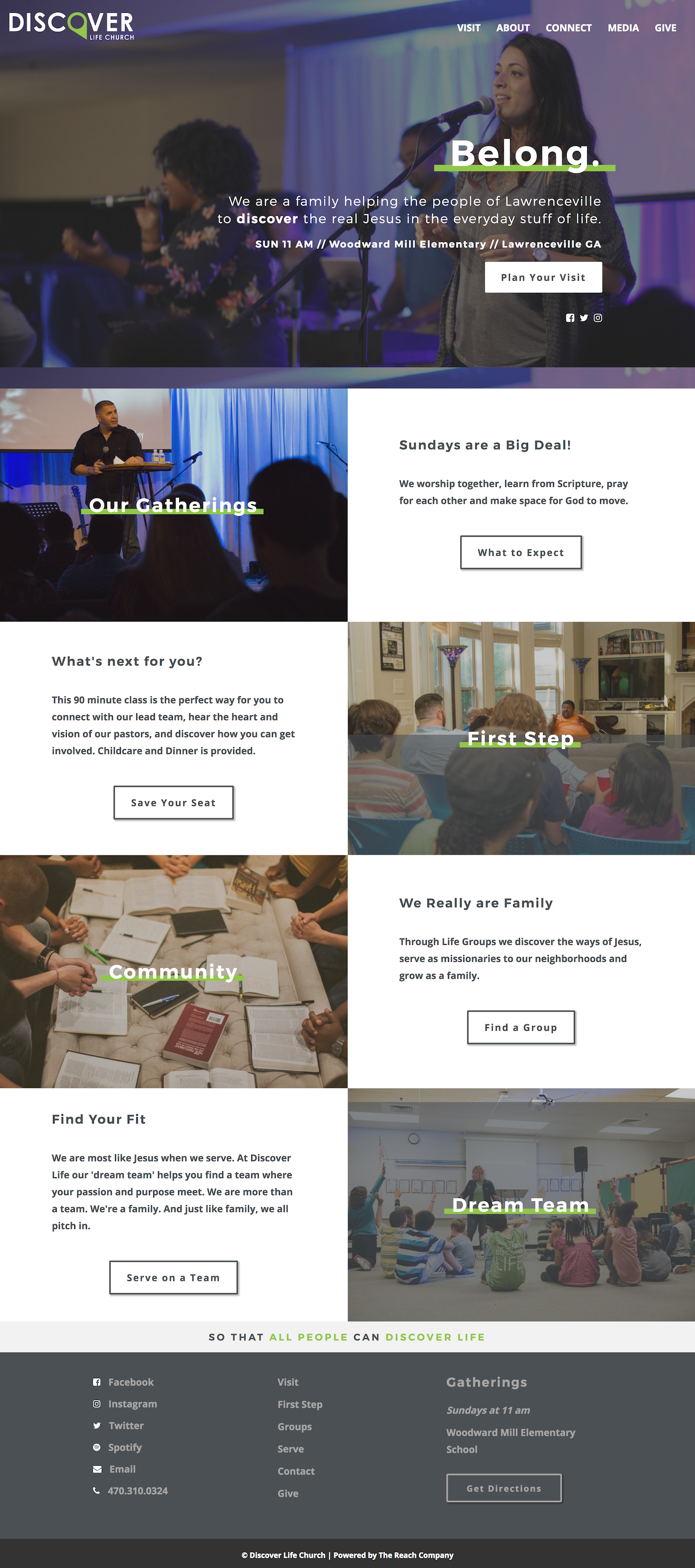
Discover Life Church uses a split screen layout so headings and text are visible at the same time, while still making significant use of photos
Streaming media
In the last few years, streaming media has really exploded. 26% of visitors to church websites listened to or watched streaming media.
Don’t have a video camera? Well, do you have a smartphone? You can make a video welcoming people to your meeting and telling a little about it.
Or maybe you use a Quaker Speak video embedded on your visitor page to explain what to expect in meeting for worship or some other aspect of Friends.
Finally, programmed Friends can (and should) have a recording (video or audio) of a sermon. You could have several, or you could even start recording weekly so Friends who can’t make it can still hear the message. Audio recordings can be made available as a podcast, as West Hills Friends Church does.
Future-proofing
Is there a way to be sure that what you build now won’t turn into an obviously outdated trend in 3–5 years? Not entirely. There is a point at which you do need to budget for a new website every 3–5 years, just like you budget for a new roof on the meetinghouse every 20 years. But you can make future updates less onerous (and thus less costly).
Thanks to modern web design, changing the look of a site while retaining the content is much easier than in 1998. We used to have to rewrite every page. Ugh! Now we can set a new heading font in one place and have it change on every page of the site!
If your current site was built the same way we did it in 1998, yeah, this year’s upgrade will be pretty involved. You’ll probably start over with current web tech and paste in your wording. Five years from now, upgrades will be easier.
And anyway, if you catch up to 2017 now, it’ll be that much longer before the site looks really outdated, than if you only catch up to 2012 now.
Series
- Websites are for newcomers
- Web design in 2017 (this post)
- Suggested WordPress plugins
- Tech to use


Recent Comments