In the United States, religious organizations are exempt from the Americans with Disabilities Act. “We won’t be fined” isn’t a good reason to be lax on web accessibility, though. We want our websites to be usable by as many people as possible because we want to be able to say truthfully all are welcome.
How can you get started ensuring your meeting website has good web accessibility? Images, color, and streaming media are the three primary areas to focus on.
Images
All images should have alt text. Alt text is the text that is read as an alternative to showing the image. If the image is broken, this text will show instead. If the person is blind or has low vision, this text will be read out. If you are using a content management system, such as WordPress, there should be a space in the media manager to fill in alt text.
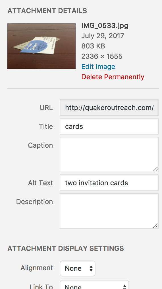
The WordPress media details panel
If you are still writing your HTML by hand (why? Do you not want to ever be able to hand off website maintenance to a new volunteer?), then you add alt text using the alt attribute. For example:
<img src="myphoto.jpg" alt="two young white women walk along a beach" />
The alt attribute is required by HTML standards; however, it is not always ideal to include a description. Use some logic. If the image is merely decorative, it doesn’t need to be described in detail. Perhaps it’s a single image functioning as a page divider or horizontal rule. In that case, alt="divider" is sufficient. If you have 15 star images in a row making a divider, mark the first one, and use alt="" in the remainder. Would you want to listen to your computer saying the words “star graphic” 15 times in a row? I didn’t think so. You know what’s worse? If there’s no alt attribute at all, it’ll read out “myphoto dot jay peg”.
If you’re using an icon font (such as Font Awesome), you may need to make some phantom text that only a screen reader will see. You can do this by positioning the text off-screen.
Got a WordPress theme that doesn’t handle icons right? You can use a little bit of Javascript to add the screenreader text yourself:
document.querySelectorAll(".et-extra-icon-facebook").forEach((icon) => {icon.innerHTML = "<span class='hidden'>Facebook</span>"});
That code will work for the Facebook icons on a theme by Elegant Themes (such as this one, or the very-popular Divi theme). Use the CSS from the off-screen text trick linked above.
Color
Contrast
It’s important to ensure there is enough contrast between the background of a webpage and the text on top of it. The Web Accessibility Initiative has defined a formula for calculating the difference of contrast between a background and foreground color. You don’t need to actually do the math, though. Lea Verou created a contrast checker which accepts color descriptions in any format the web browser accepts. Regardless whether you write:
- red
- #ff000
- #f00
- rgb(255,0,0)
- hsl(0, 100%, 50%)
That tool will understand that you mean red and calculate accordingly.
Something important to keep in mind is that the smaller the text is, the larger the contrast needs to be for it to stay legible. Consequently, passing color combinations are defined on the basis of the text size.
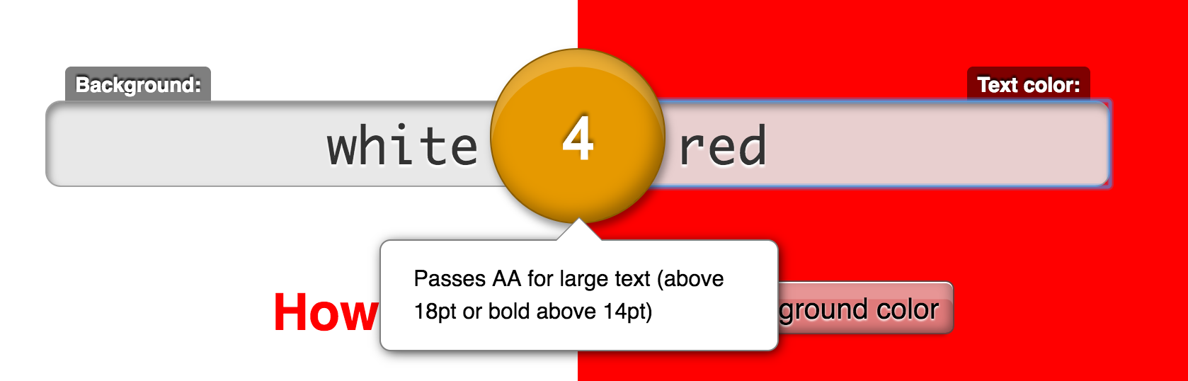
Results of testing red text on white
As you can see from the screenshot above, pure red text is only acceptable on a white background if it’s size 14pt or larger. Might want to try maroon.
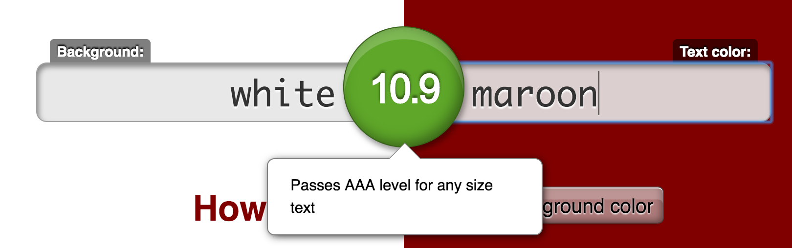
Results of testing maroon text on white
Ah, that’s much better! Just because it says maroon “passes AAA level for any size text” doesn’t means you should take it as free-rein to use 8pt font. 16pt is the sensible default set by browsers. Consider carefully before going smaller than this.
Auditing tools will run into trouble when there’s transparency involved. For instance, the tag list in the sidebar of this website is made (don’t ask me why!) with each having a dark blue background that then has a mostly-opaque white overlay. The visible result is dark grey text on a pale background. The automated checkers fail these, however, comparing the dark blue to the dark grey text. A color picker tool, such as Sip, can grab the actually displayed color values. Plug these into the contrast checker linked above.
Color blindness
There are many forms of color blindness. Red/green is the most common, but you should still test for the others. If you use Paletton (formerly known as Color Scheme Designer) to generate a complementary set of colors for your website, keep in mind that it has a colorblindness simulator. Use it!
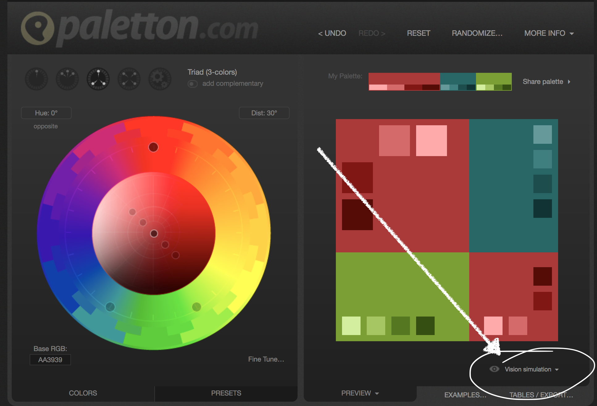
Use the visual simulators to ensure your palette works.
Any accessibility checker should be able to show you your website as if you had various forms of color blindness.
Streaming media
All streaming media should have transcripts. No, captions inserted into a video are not sufficient. If you are Deaf and cannot hear a video, does that necessarily mean you can see the visuals of the video? Of course not. Plenty of people are both Deaf and blind! These folks use a device called a Braille TTY. It’s a flat surface which raises bumps as needed, allowing someone who is both Deaf and blind to read Braille off its surface. Since the screenreader on a computer cannot read the captions embedded in a video, those captions cannot be passed on to the Braille TTY.
Instead, you should make full transcripts available. Don’t underestimate how long transcription takes. It can easily take six times as long as merely listening once. It may be worth paying a service such as Rev to transcribe for you. Rev charges $1 per minute of audio. There are cheaper services that are done using computer automation. They will require significant human editing.
Bonus: the text from the transcripts help your search engine rankings for whatever words are used in the video or audio.
Other considerations
Most of this has focused on visual impairments, but there are other things to keep in mind.
Someone with hand tremors will have trouble with clicking on small things. Make the navigation links on your website large. If you have a navigation bar, link the entire rectangle that holds the text, not just the text itself.
Someone with auditory processing difficulties, dyslexia, ADHD, or autism may have great difficulty if your website starts playing audio on its own. Do not auto-play! Let people press a button to start audio manually.
You can give an epileptic person a seizure using flashing graphics. The standard “safe” rate is 3 flashes or fewer per second. Note that this doesn’t only mean camera flashes, but any fast motion resulting in a change in brightness of the graphic.
Listening to the entire navigation menu on every single page gets old fast. Include hidden a “skip to content” link at the top of your site, which will jump the screenreader to the main text of the page. There’s a WordPress plugin that can do this.
Good usability will disproportionately help people with cognitive difficulties and those who are less computer literate, though everyone benefits.
Resources
If you want to learn more or test your website, check the links below.
- WebAIM (Web Accessibility in Mind) articles
- WAVE (Web Accessibility Evaluator Tool)
- Web Content Accessibility Guidelines (WCAG) 2.0 checklist
- Accessibility Handbook
- aXe Chrome extension checks webpage accessibility even if the site isn’t publicly accessible yet (such as if you’re building a new one on your computer)
- Chrome Dev Tools now include accessibility audits


Recent Comments